The Challenge
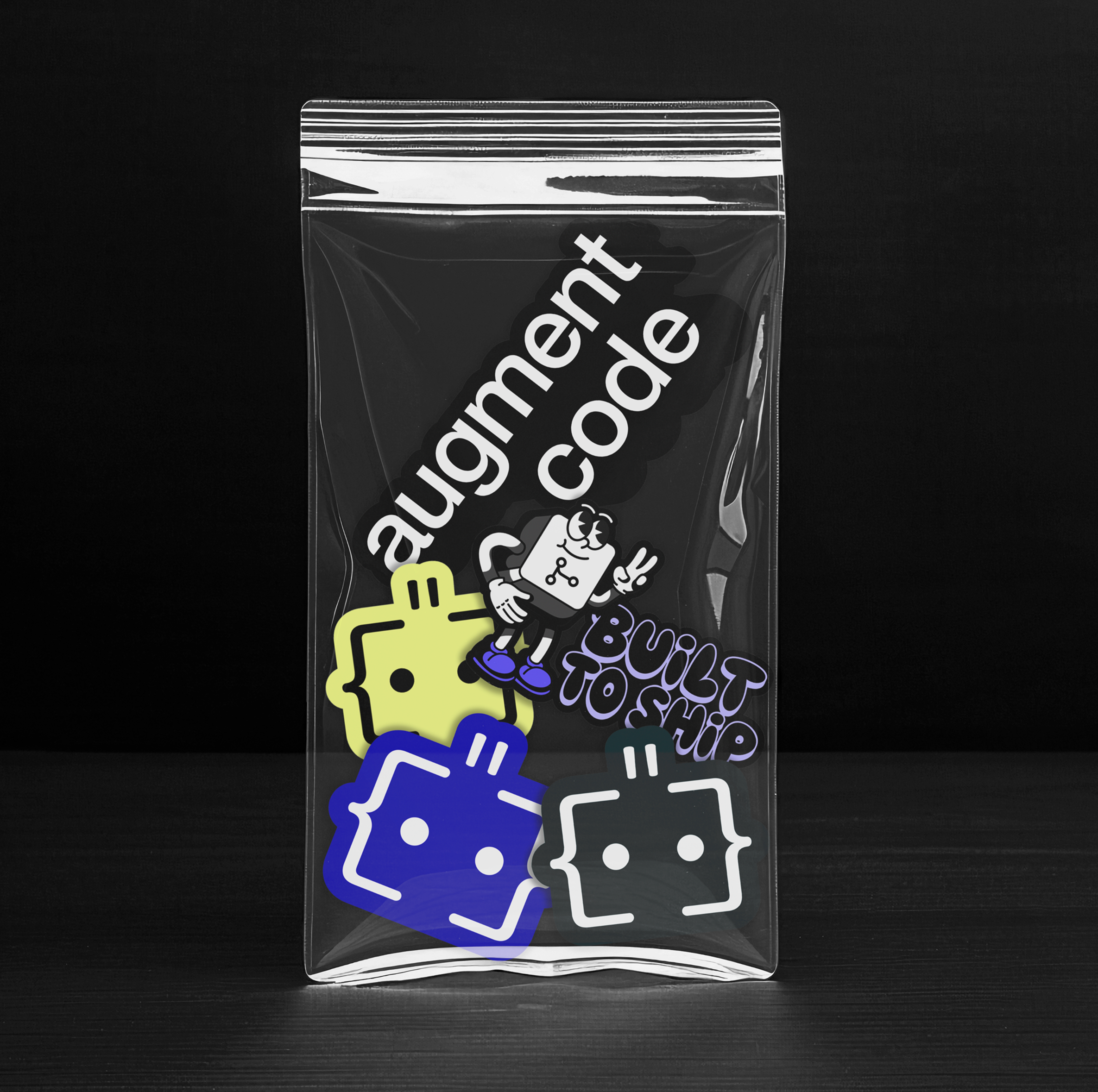
Augment’s initial brand relied on only a few disconnected elements, which quickly became repetitive. Non-designers struggled to use it effectively, and the limited range made the brand feel flat to audiences over time.

Moving through Creative R&D
Former partnered with the Head of Brand at Augment Code to evolve the visual identity through research, competitive analysis, and iterative testing. The goal: fit within the AI software category while looking nothing like the rest of it.
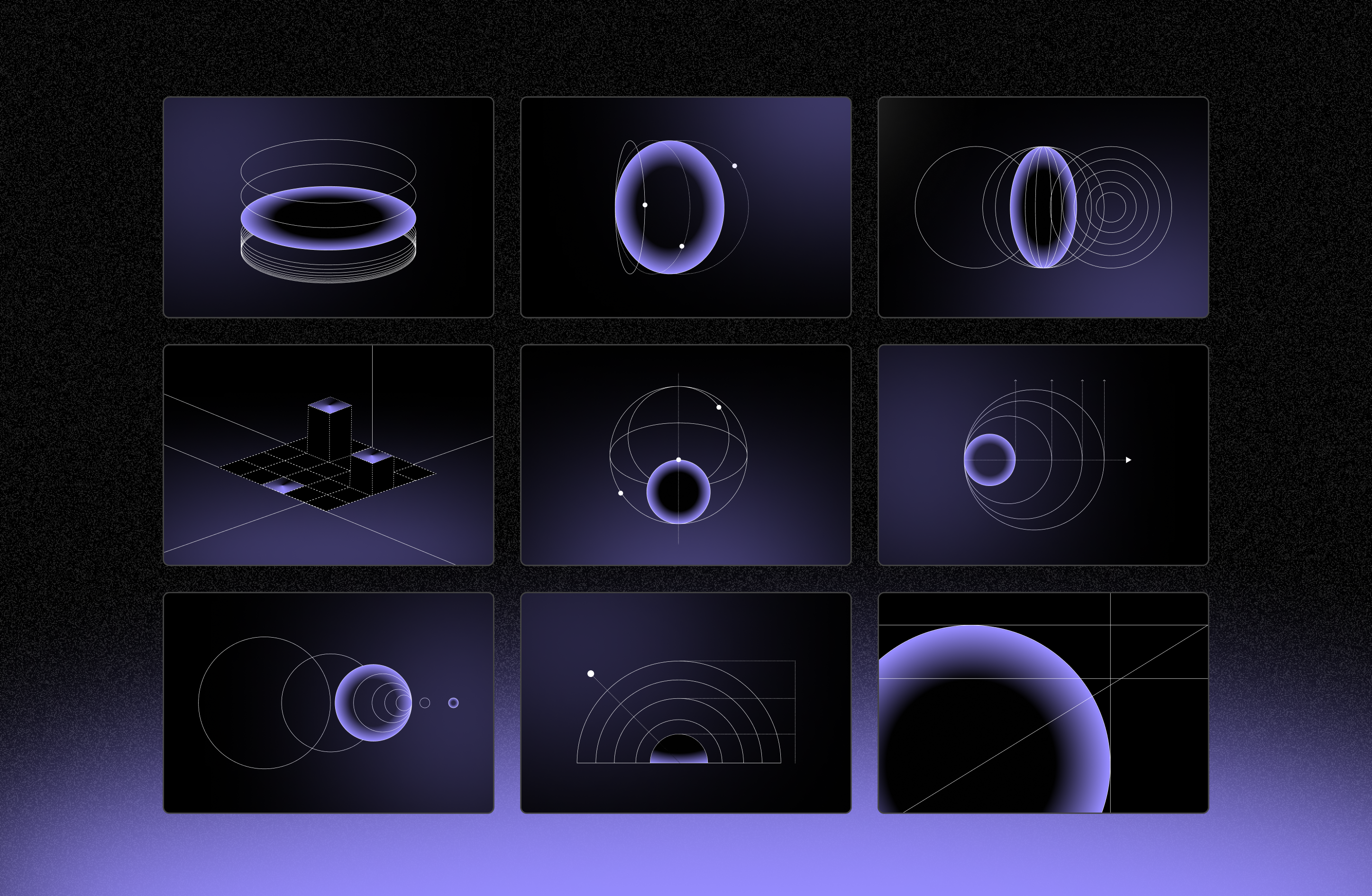
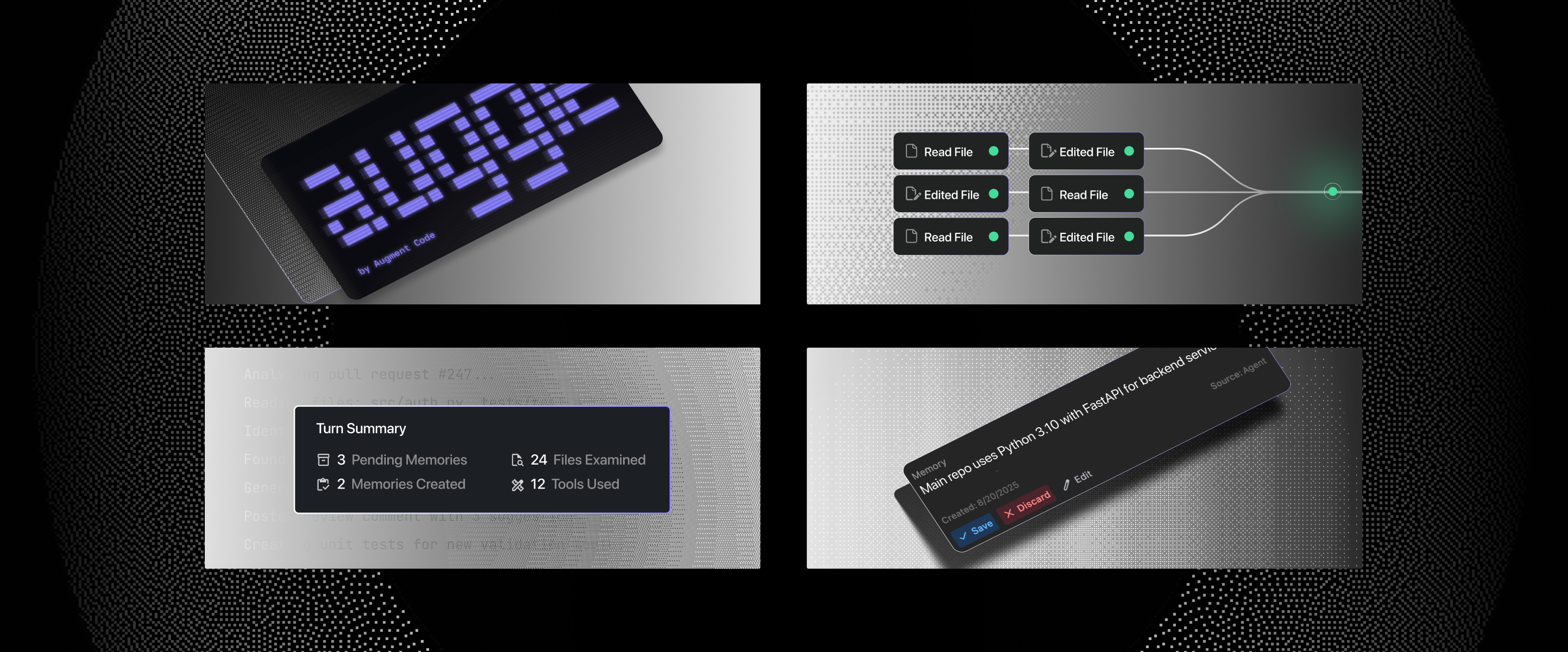
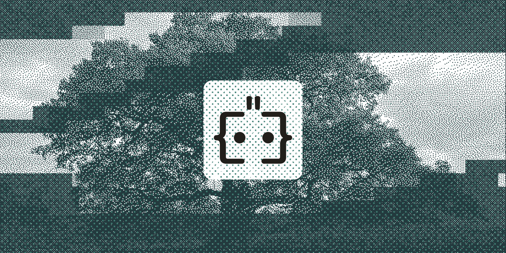
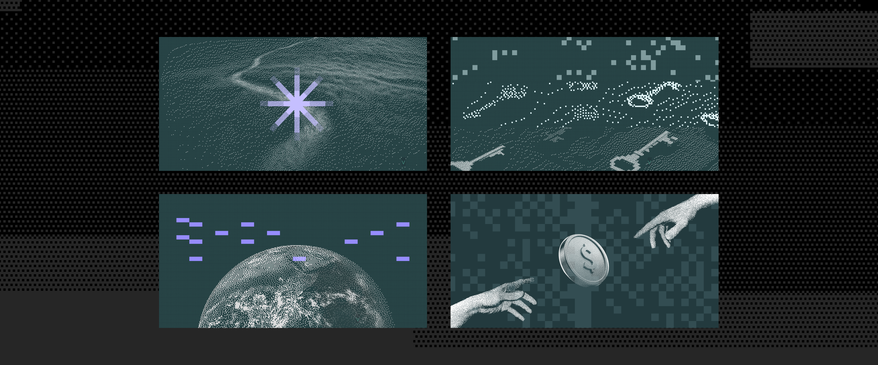
We explored a spectrum of directions: (1) multi-scale pixel treatments that move from coarse grids to fine detail, which mirror how engineers move between high-level architecture and low-level code; (2) digital dithering to reference early graphics, old renderers, bitmap tools, low-bit displays. Both were elements that felt authentic, not decorative to engineers.
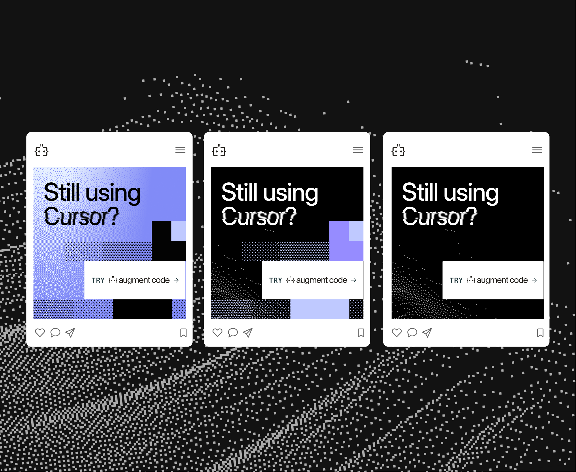
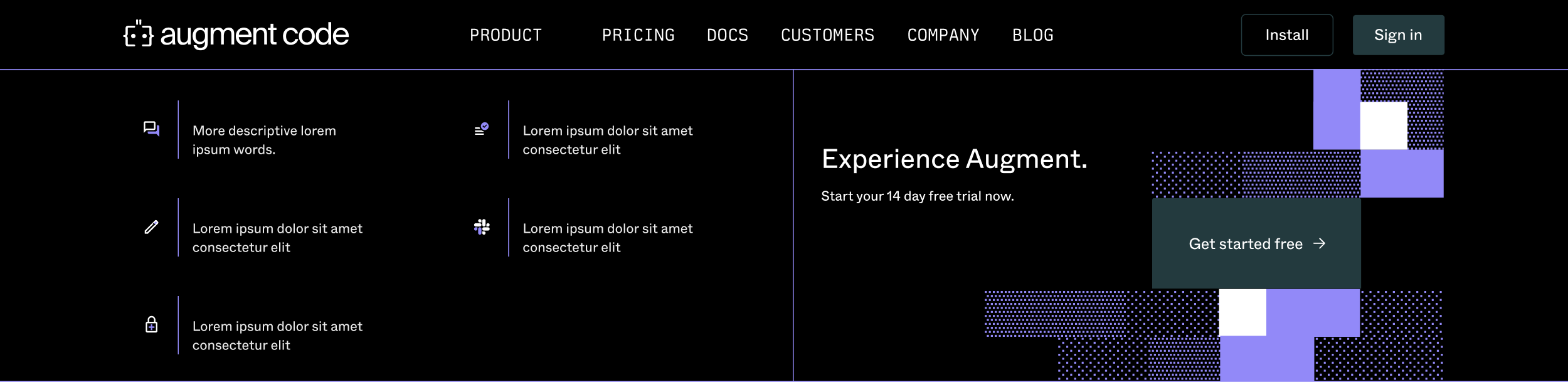
The website became the first place to pressure-test these elements.


Learning and Scaling with Demand
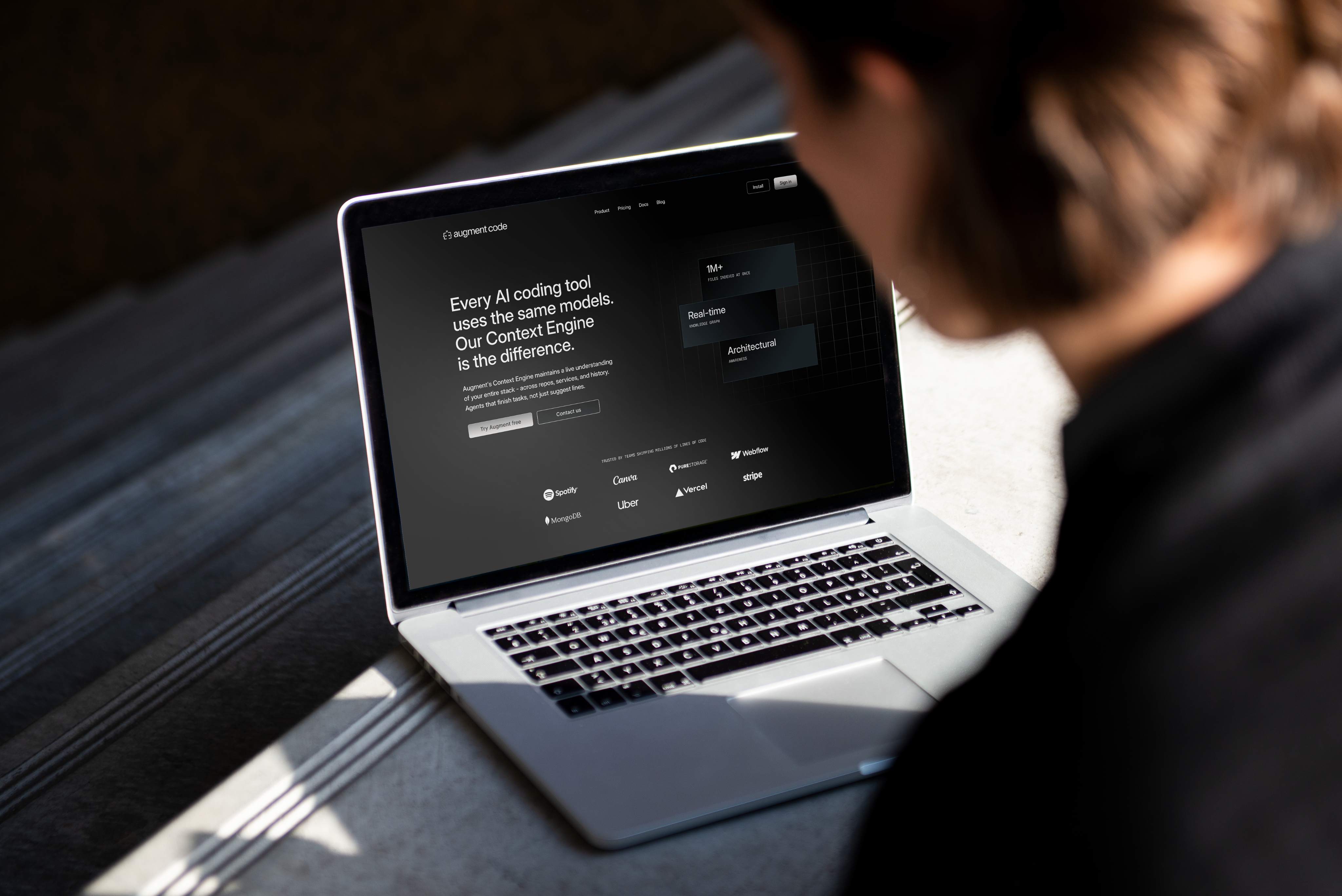
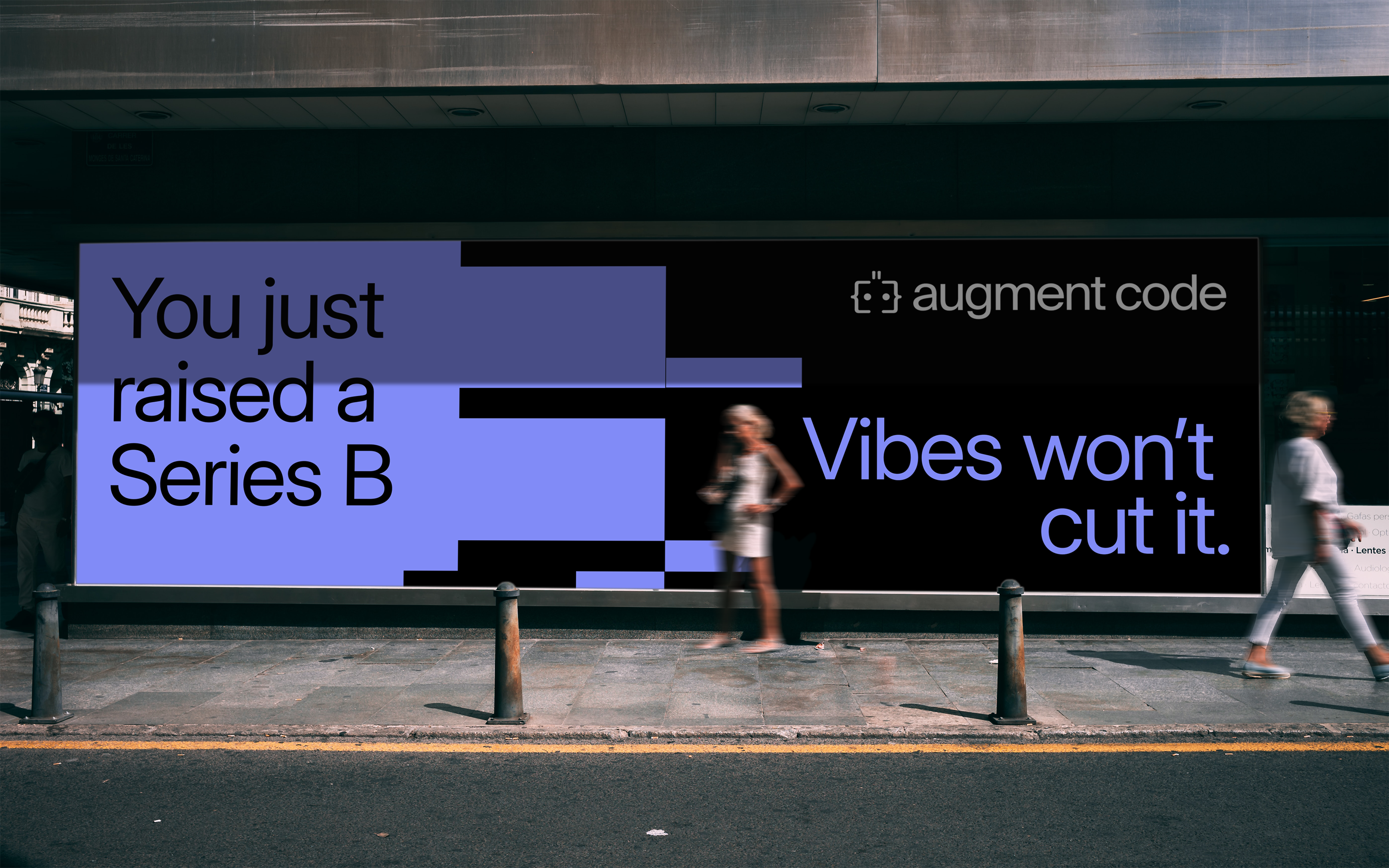
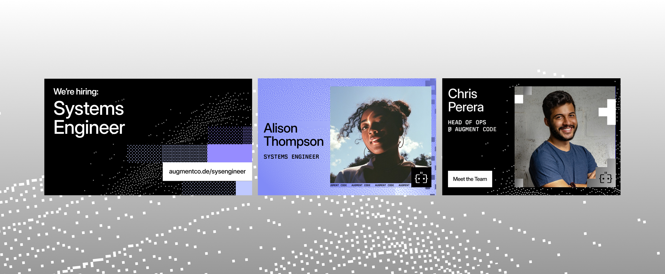
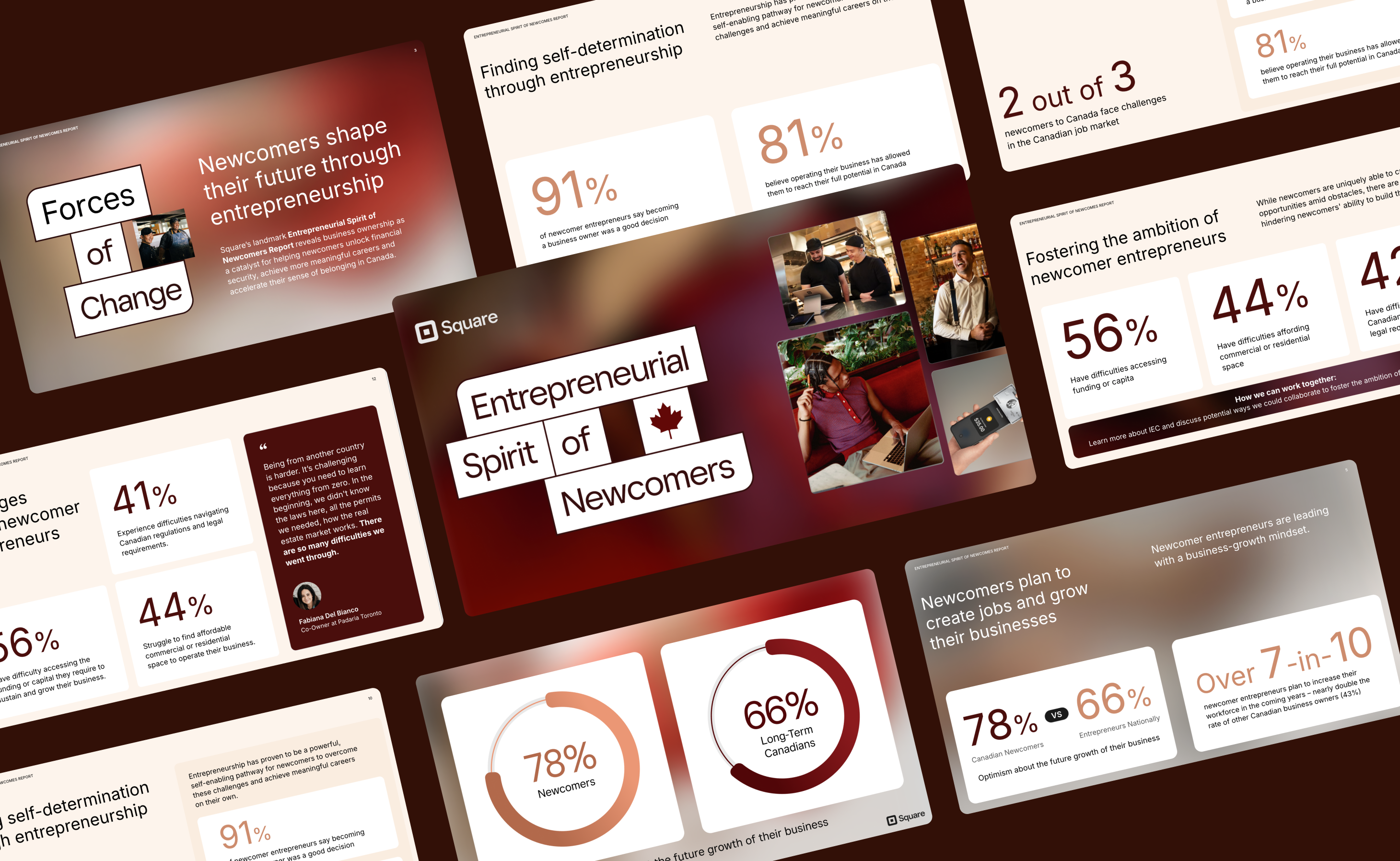
As the company scaled, the brand expanded into a cross-channel system: website builds, feature explainer visuals, product diagrams, high-volume paid campaigns, billboards, customer story kits, presentation systems, and tradeshow booths. We took learnings from performance data in order to adapt visuals to audience behaviour, refine product storytelling, and build a sense of culture through design. This work spanned the better half a year and continues to settle as the brand matures overtime.